
A fairytale rebrand for San Francisco's oldest Russian bakery
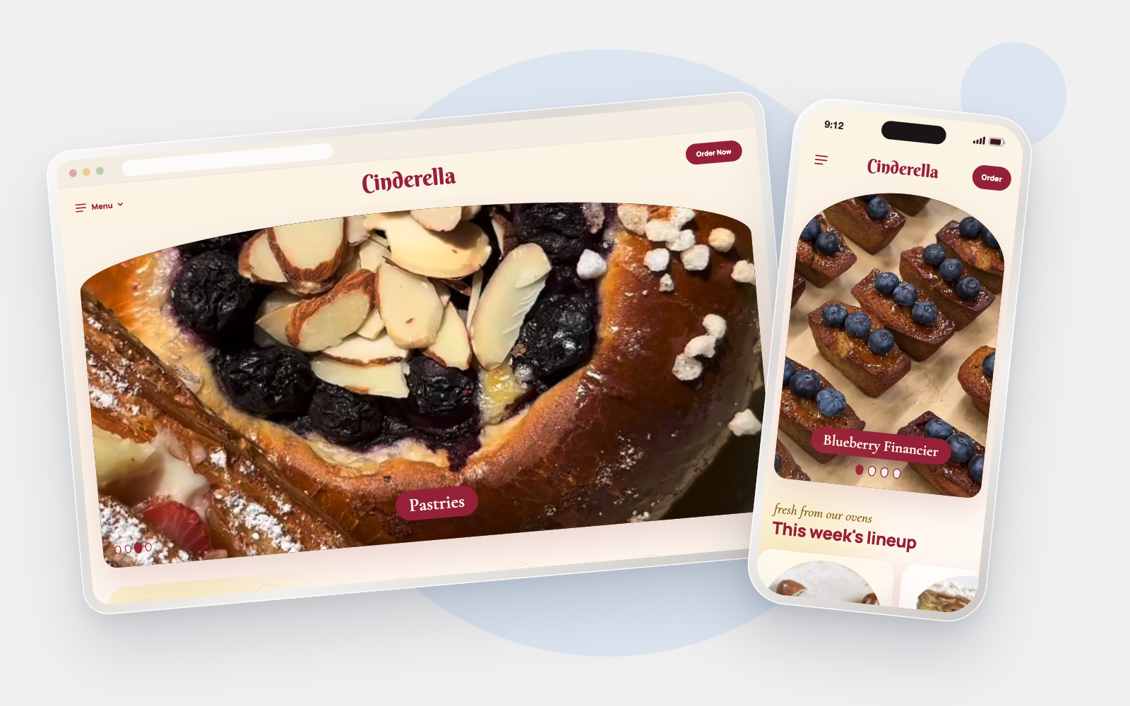
Cinderella Bakery & Café has been making Russian pastries on Balboa Street since 1953. The food is amazing and their Instagram is full of gorgeous videos, but the website doesn't show any of it. You have to dig to find the food, and ordering is easy to miss. So I gave the brand and site a fairytale makeover that leans into the Cinderella name and puts the food front and center.
I came across Cinderella by chance one day on a walk, and I was surprised by how much they have to offer.
My role
Self-initiated concept, not commissioned by Cinderella Bakery. My role was solo designer: research, brand, UI and prototyping. The deliverables include desktop and mobile homepage, mobile ordering app (interactive prototypes), style guide, packaging, social. The tools I used were Claude (design canvas, interactive prototypes and docs), Google Fonts.
Background
Two sisters opened Cinderella in 1953 after making their way to San Francisco from Harbin, China. Seventy years later it's still on the same block, still making piroshki, pelmeni, dark rye and homemade kvass. It's also on the city's Legacy Business Registry, which asks the bakery to keep its name and its nesting-doll logo. That became my main rule: keep the name and the doll, and change everything else.
The problem
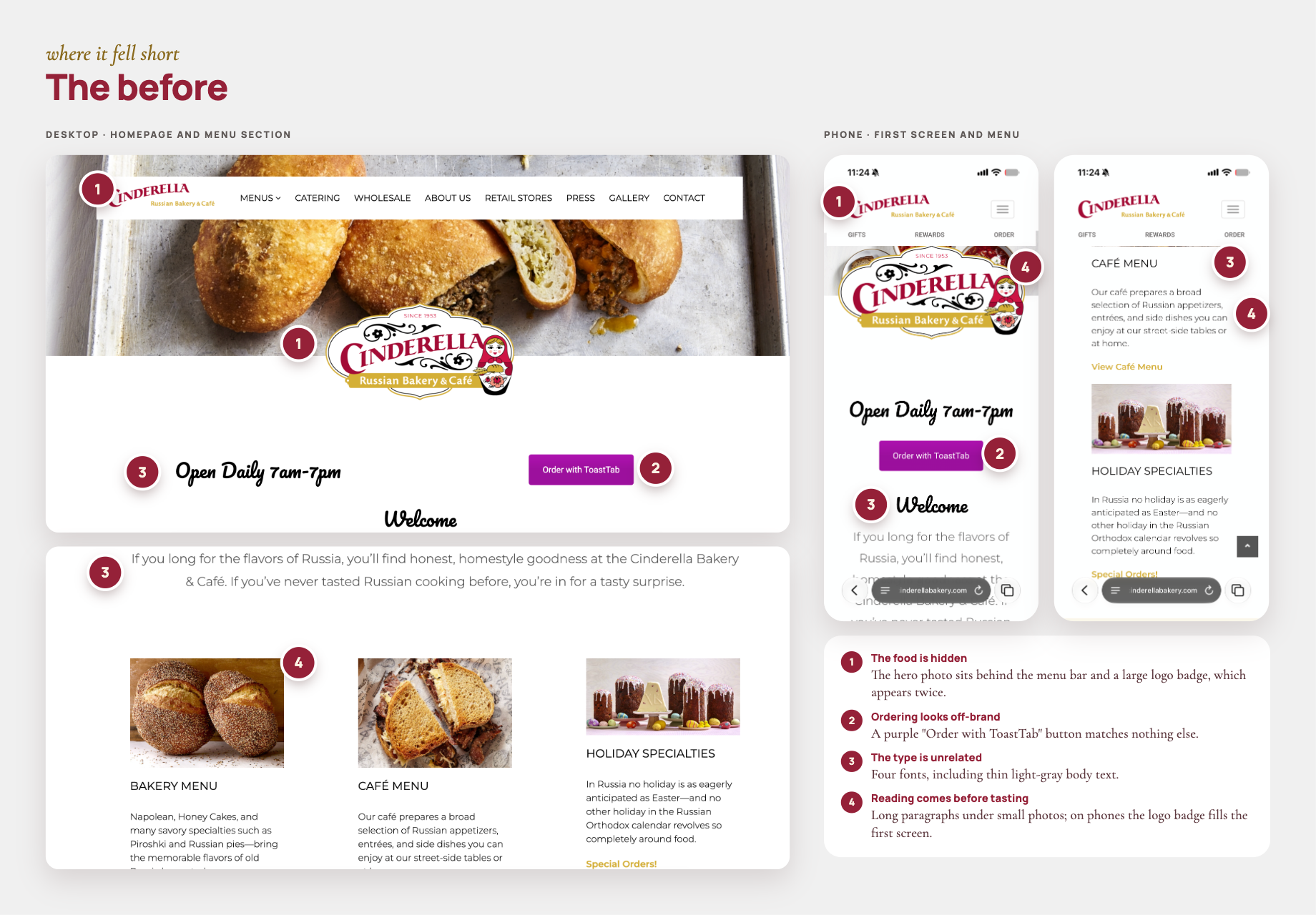
Cinderella's food and Instagram are beautiful; its website isn't. My October 2026 audit found four issues:
1. You can barely see the food. The main photo is covered by the menu bar and a big logo badge, and the logo shows up twice on the first screen.
2. The order button doesn't look like Cinderella. It's a purple ToastTab button that doesn't match anything else on the site.
3. There are four different fonts, and the body text is thin and light gray, so it's hard to read.
4. There's a lot of reading before any tasting. Small photos sit on top of long paragraphs, and on a phone the logo badge takes up the whole first screen.
So I gave myself four goals: keep the crimson, gold and doll that regulars know, put the food first, make ordering one tap away, and add a little fairytale fun.
Brand direction
The idea was a fairytale Russian bakery: pretty enough for a gift box, fun enough to make you smile, and always about the food.
Why a fairytale? The bakery has been called Cinderella for over 70 years, and the old site barely used the name. Painted nesting dolls and Russian folk tales already feel like a storybook, so it felt like a natural fit instead of a gimmick. My one rule was to stay far away from anything Disney.
Exploration
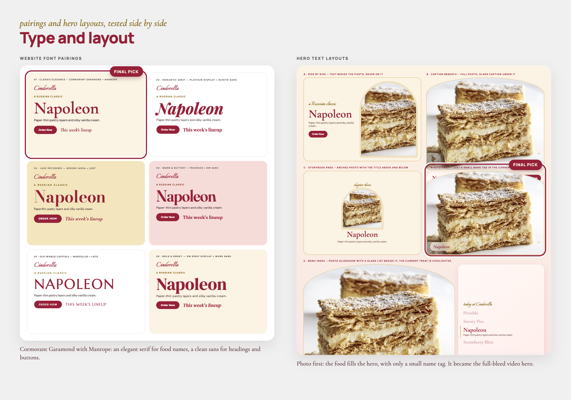
I tried a lot before landing on anything. I sketched six logo ideas and tested eight fairytale fonts. Berkshire Swash won because its curly swashes remind me of an old bakery sign, and it still reads well at small sizes. I also compared six font pairings and a few different ways to lay out the top of the homepage.

Plenty didn't make it. Pink-and-black and powder-blue palettes lost the connection to Cinderella's crimson and gold. A couple of castle-window logos felt more like a castle than a bakery. Sparkles and gold swirls fought with the food photos. And a cartoon doll was just too cute. It made the place feel like a kids' café.
The design system
The direction I went with, which I called Fairytale Bakery, puts big food photos and videos next to the crimson, gold and cream from the original logo, plus a newly painted doll.

Every color comes from the original logo: crimson #952138, gold #CEB04E, cream #FBF3E4 and blush #F9E7E5.
A lot of Cinderella's regulars read Russian first, so I made the system bilingual. English leads, and the Russian name sits next to it in gold italic. Cormorant Garamond and Manrope both support Cyrillic, but Berkshire Swash doesn't, so I set the Russian wordmark, Золушка, in Lobster, which has the same old bakery-sign feel.
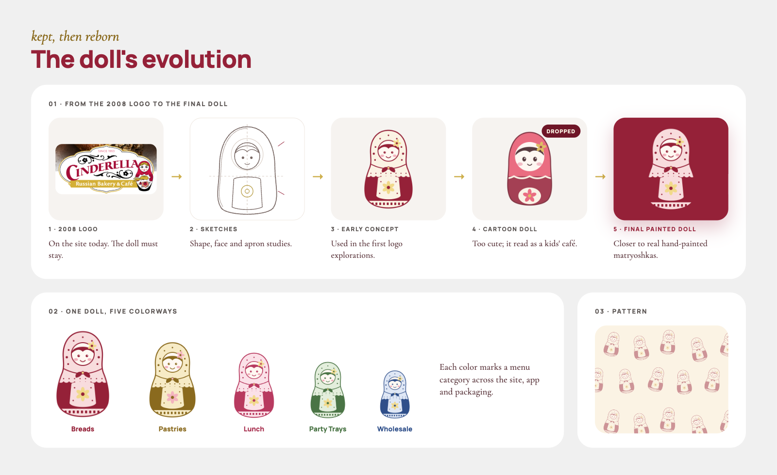
The nesting doll has been Cinderella's logo since 2008, so I didn't want to lose it. Instead, I redrew it as a painted matryoshka and made five color versions, one for each menu category. It also works as a repeating pattern.
I added small bits of movement to make it feel playful: cards float up, dolls open and close, and buttons squish when you tap them. All of it turns off for people who have reduced motion on.
The website
I designed two pages: the homepage and a full menu page, connected by a new navigation.
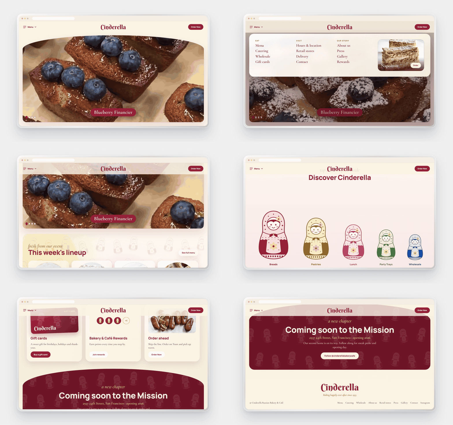
Navigation. The old site had a long row of links. I kept the top bar simple: a Menu button on the left, the swash logo in the middle and a crimson Order Now button on the right that goes straight to Toast. Tapping Menu opens a dropdown that sorts every page into three groups: Eat, Visit and Our story. Next to the links there's a "this week" card with a photo of the Napoleon and its own Order button, so even the menu sells the food.
Homepage. It opens with Cinderella's own videos in an arched frame, and each clip moves to the next when it ends, with a name tag for each one, like Blinchiki or Piroshki. Below that:
1. This week's lineup, with four favorites in doll-shaped frames and a link to the full menu
2. Discover Cinderella, where you tap to open the nesting dolls and each one leads to a menu category
4. Hours and location, with buttons for pickup and directions, plus Caviar, Grubhub and Uber Eats for delivery
5. Gift cards, rewards and ordering ahead
6. A "Coming soon to the Mission" banner for the second location
7. A footer that signs off with "Baking happily ever after since 1953"
Menu page. The old menu was a wall of text. Mine opens with a photo of the counter and "Our menu," then a sticky glass bar of category tabs, each with its own doll. The five sections are Piroshki & pies, Pastries & cookies, Breakfast & lunch, Whole cakes & party trays, and Drinks & take-home. Each one starts with a big photo, its doll and the Russian name in gold italic. Items are listed like a printed bakery menu, with the Russian name next to the English one and dotted lines leading to the price. It ends with a catering section for party trays and whole cakes.

The ordering app
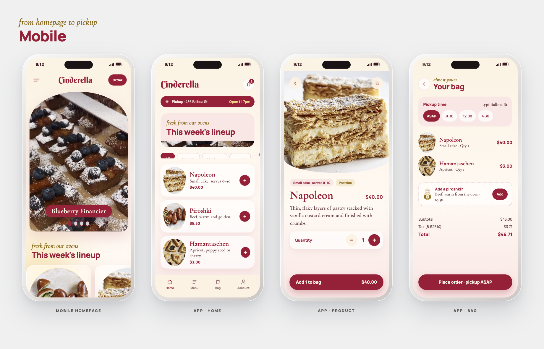
I wanted to see if the system would hold up past the homepage, so I designed a small pickup ordering app with three screens: a home screen with this week's lineup, a product page where you pick how many, and a bag where you choose a pickup time. There's even a little painted doll next to the "Add a piroshki?" suggestion.
Packaging
I wanted to see the brand in people's hands too, so I designed a few take-home pieces. The pastry box is crimson with a faint doll pattern, a cream oval for the logo and a gold ribbon. The coffee cup has a crimson sleeve with the same pattern and "fresh from our ovens" under the logo. For the paper bag I made two options: a plain kraft bag with the crimson logo, and one with the doll pattern printed all over.
The fun part is the stickers. Instead of putting the doll on everything, I turned the dolls into free die-cut stickers, one with every purchase, in all five colors. It gives people a small reason to come back and collect them all.

How I used AI
I used Claude a lot on this project, especially Claude Design. It made prototyping so much faster. I could go from an idea to a clickable homepage, menu page or ordering screen in one sitting and click through it right away, instead of spending days building static mockups. It also helped me find the visual direction. It gave me lots of logo, font, color and layout options to react to, drew doll variations and helped me research the bakery.
Nothing came out right on the first try. Every board went through a lot of rounds of iteration: I'd look at a version, figure out what felt off, ask for a change and look again. The navigation, the hero and the packaging each changed many times before they felt right. I made the calls on what to keep, what to cut and what to change, and the exploration boards show all the options I said no to.
Reflection
Leaning into the name is what made this work. It gave Cinderella a story no other Russian bakery has. Having to keep the doll actually helped too, because it pushed me to rework it instead of starting over. And taking the brand all the way from the homepage to checkout showed me it really holds together.
This is a self-initiated concept, not commissioned by Cinderella Bakery & Café. Food photos and videos belong to Cinderella Bakery & Café.


