Overview
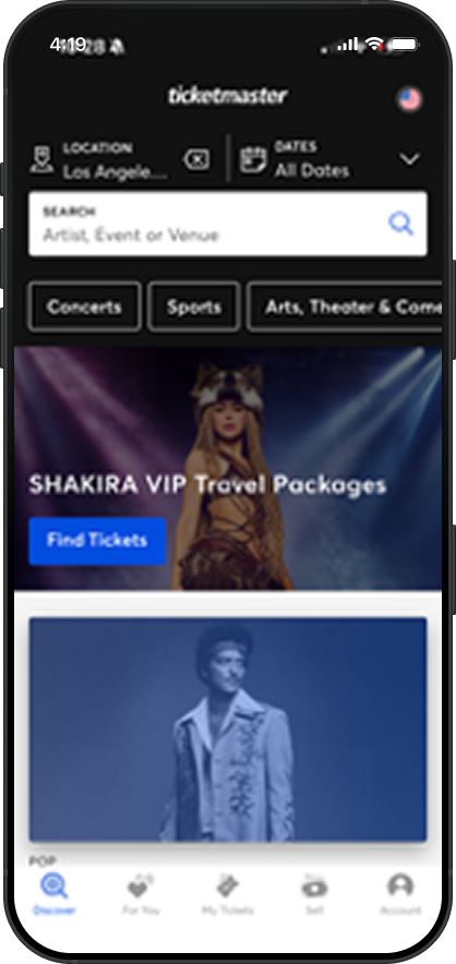
Ticketmaster is the dominant live event ticketing platform in the US, controlling over 70% of the market through exclusive venue deals. It allows users to browse, purchase, and store tickets for concerts, sports, and live events.
Because of its monopoly position, users have no alternative, they are forced to use the app regardless of the experience it delivers. This makes it a uniquely compelling subject for UX analysis: the product faces almost no competitive pressure to improve.
The Problem
Across research, user reviews, and direct app testing, five critical failure patterns emerged, each violating foundational UX heuristics at the moments users need the app most.
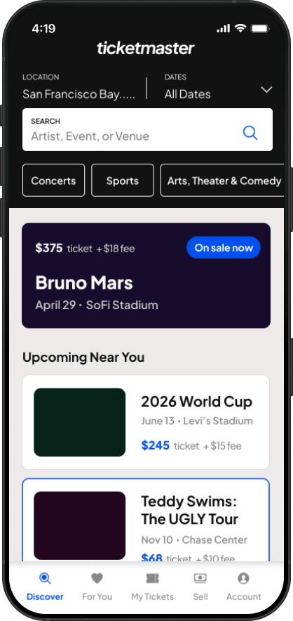
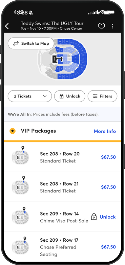
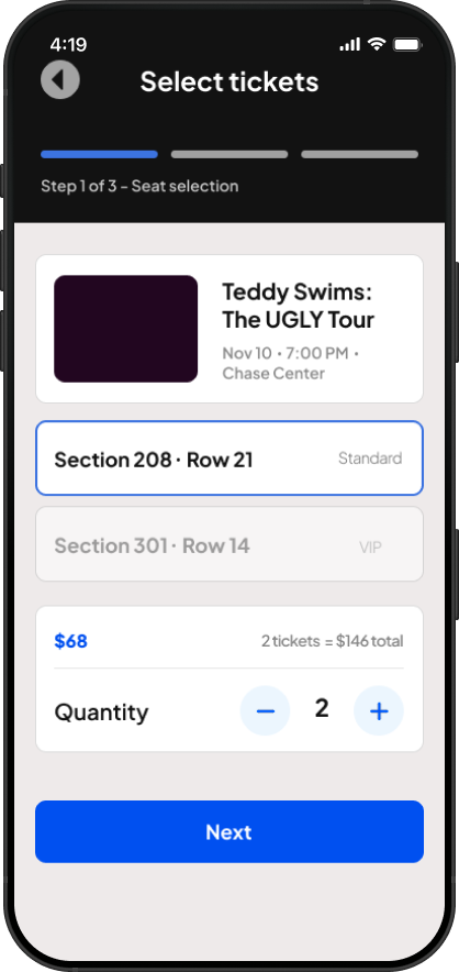
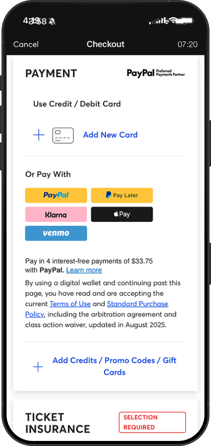
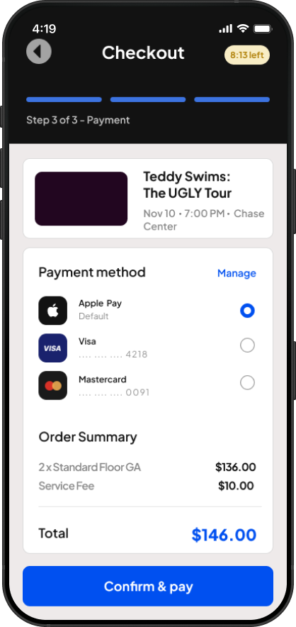
Hidden fees at checkout — Base price shown throughout browsing; 30–50% in fees revealed only at payment.
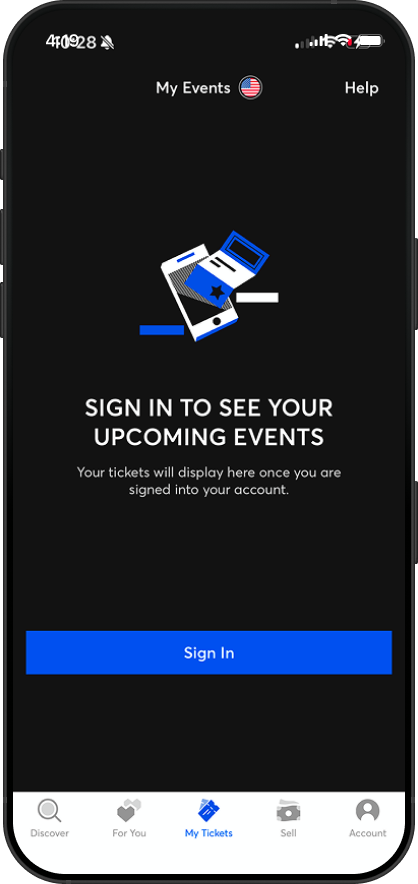
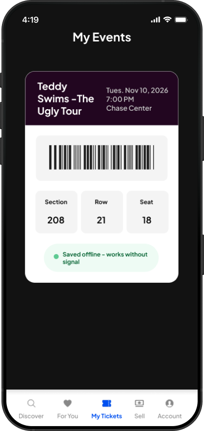
Broken session management — Users are logged out unexpectedly and unable to view tickets at the venue door.
Panic-inducing timers — Short countdowns force rushed decisions during a high-stakes, high-value purchase.
My Role
This was an independent project. I conducted the full heuristic evaluation solo, synthesized real user complaints from app store reviews and consumer forums, mapped each issue, and developed concrete redesign proposals for each problem area.
What I Did
1. Scoped the audit — Defined the scope around the core purchase funnel, the highest-stakes flow in the app, from event discovery through ticket access at the venue.
2. Gathered evidence — Collected user complaints from the iOS and Google Play app stores, consumer review sites, and UX-focused analyses of major incidents (e.g. the Taylor Swift Eras Tour on-sale failure).
3. Synthesized patterns — Grouped findings into five distinct problem areas, each with a clear UX principle at stake, a user impact statement, and a real user quote illustrating the pain.
4. Developed recommendations — Produced actionable redesign recommendations for each issue, prioritizing changes that are technically feasible, user-centered, and address root causes rather than symptoms.
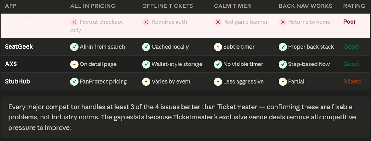
Competitive Analysis
Hi-Fi Wireframes
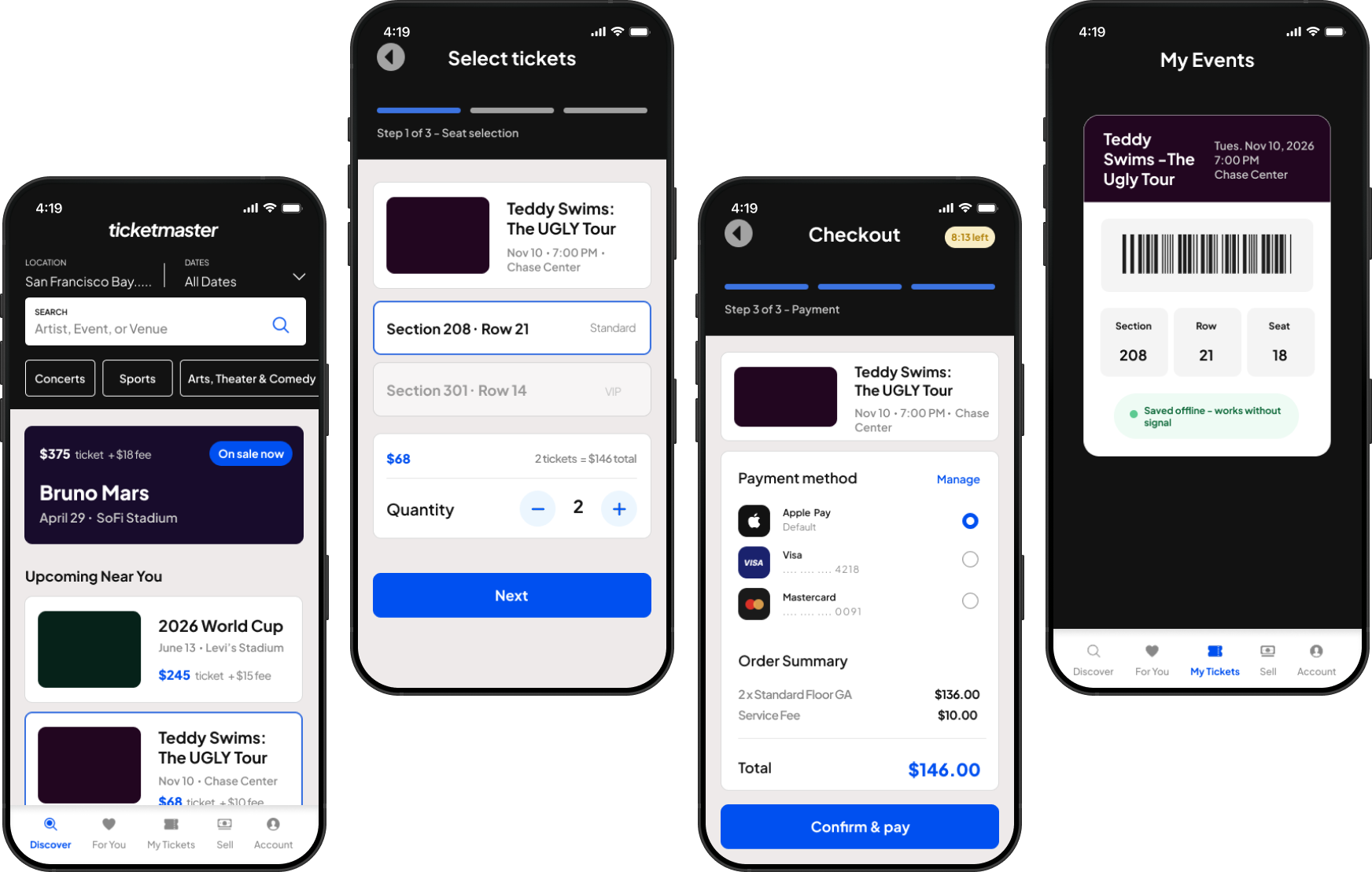
Keeping Ticketmaster's existing visual design, fixes are surgical changes to interaction patterns and information architecture, not a visual rebrand.
Fix 1 - Transparent pricing
Before
Base price only, fees hidden until final checkout screen
After
Fee breakdown shown on every listing from search
Fix 2 - Ticket access at venue
Before
Auth failure locks out tickets at the venue door
After
Barcode cached locally, works without signal
Fix 3 - Back navigation and progress
Before
Back sends user home, all progress lost
After
Step bar + breadcrumb, back returns to previous step
Fix 4 - Calmer checkout timer & easier checkout
Before
Timer throughout checkout hidden, lots of scrolling before checkout
After
Subtle amber pill, only during checkout
Next Steps & Reflection
Usability Testing — Run moderated sessions with 5–8 real Ticketmaster users on the redesigned checkout flow to validate that fee transparency and back navigation changes reduce confusion.
A/B test fee display — Test inline fee breakdown vs. all-in total to measure which format increases checkout completion without increasing abandonment rates.
Accessibility Audit — The countdown timer likely fails WCAG 2.1 timing requirements. A full audit would surface additional issues beyond the five identified here.
Performance Deep Dive — Queue failures during high-demand sales need a separate systems investigation, likely a backend problem more than a UI one.
Monopoly changes the design problem. Most UX work assumes competitive pressure forces improvement. Ticketmaster removes that assumption, the case for fixing UX has to be made on user welfare and brand trust alone.
Dark patterns are a UX problem, not just an ethics one. Hidden fees and panic timers aren't just manipulative, they generate complaints, negative reviews, and legal scrutiny. Bad UX eventually has consequences.
User reviews are an underrated research source. Consistent complaints across hundreds of reviews painted a clearer picture than a single usability test could, especially for high-stakes flows that are hard to test.
What I'd do differently. I'd recruit real users for interviews before the audit, hearing the emotional weight of being locked out at a venue in someone's own words would have made the case study more human from the start.