Overview
Asset Health delivers end-to-end employee wellness programs for enterprise clients. Their flagship product, Empowered, is a web and mobile platform where employees track health goals, complete wellness incentives, and access coaching content.
When I joined as UX/UI Designer II, the product had two compounding problems: the interface was visually outdated and inconsistent across devices, and users were struggling to navigate core flows, leading to confusion and low engagement with the program.
My job was to fix both.
The Problem
The existing Empowered platform had accumulated years of inconsistent design decisions. Components looked different across pages. Navigation was unclear. The visual language felt dated compared to what users expected from modern wellness apps.
At the same time, Asset Health had no mobile app, a significant gap, since employees increasingly expected to access their wellness program on their phone. The web-only product was limiting reach and engagement.
My Role
I owned design end-to-end across both workstreams, the website redesign and the mobile app build, working closely with an engineering team throughout.
This included: auditing the existing product, building a new design system, designing and iterating high-fidelity screens in Figma, running design reviews, and managing developer handoff to ensure what we shipped matched what we designed.
What I did
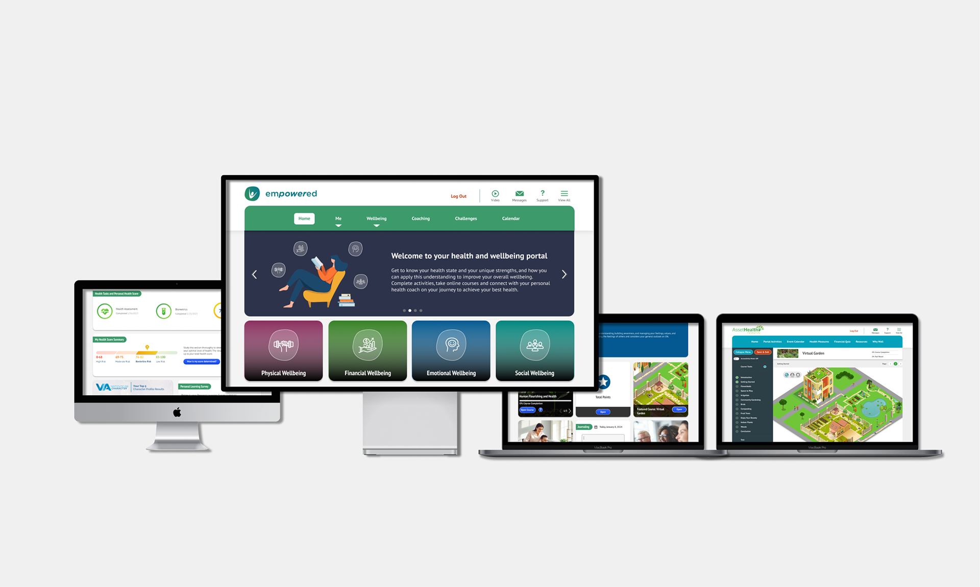
1. Design System — First Before redesigning any screens, I built a unified design syste, typography scale, color tokens, button states, tile components, and iconography, to ensure every screen we shipped would be visually consistent across web and mobile. This became the foundation for everything that followed.
2. Website Redesign — I audited every core flow in the existing product and identified the highest-friction areas: the login experience, the homepage incentive dashboard, and the Four Pillars of Wellbeing section. I redesigned each with a focus on clarity, hierarchy, and consistency, giving users a clear picture of where they stood and what to do next.
3. Mobile App — Built from Scratch Asset Health had never had a native mobile app. I designed the full iOS experience from zero, mapping the information architecture, building wireframes, and iterating through to production-ready high-fidelity screens. I worked directly with engineers throughout to ensure smooth implementation and flag anything that needed design adjustment before it hit development.
4. AI Vision Concept — I took the initiative to design a forward-looking concept showing what Empowered could look like with AI layered in a personalized health score explainer, a biometric trend detector, an in-context AI coaching chat, and a smart incentive planner. This wasn't assigned work. I built it because I saw an opportunity to show what the platform could become, and it became one of the most discussed pieces of work on the team.
Key Features Designed
Login & Onboarding — A welcoming sign-in flow that orients users to their personalized wellness program immediately on entry
Homepage & Incentive Tiles — A dashboard that motivates users to complete health incentives and track earned points or rewards
My Health — A consolidated view of health scores, biometrics, and wellness data
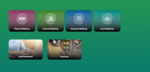
Four Pillars of Wellbeing — Dedicated pages for Physical, Financial, Emotional, and Social health, each tailored to help users take action toward their goals
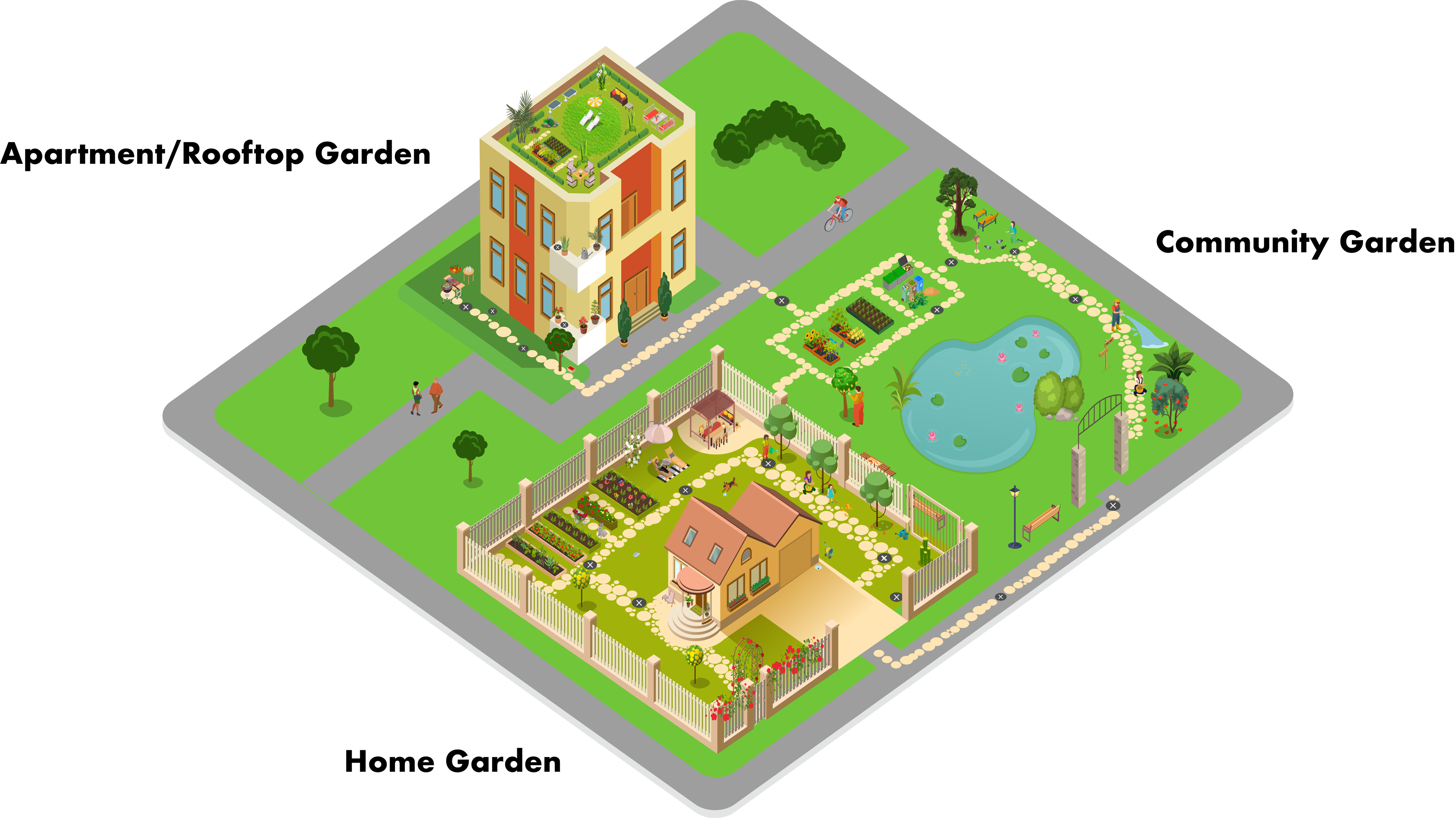
Virtual Garden Course — Asset Health's wellbeing program includes virtual courses, and I was tasked with designing an immersive 3D gardening experience. I designed three distinct environments, an Apartment/Rooftop Garden, a Home Garden, and a Community Garden, to reflect the diversity of our user base. Users walk a virtual path, stopping at interactive points to watch videos and access gardening content. The goal was to make wellness education feel engaging and personal rather than transactional.
Design Style Guide
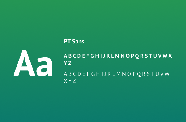

Typography: Pt Sans is our main font, its classic and easy to read. It offers variation and style with 4 different font weights.
Comprehensive Design Systems (Title tag and Image Overlay tiles): Our design system extends across mobile apps, desktop, and iPads, ensuring consistency in every tile component.
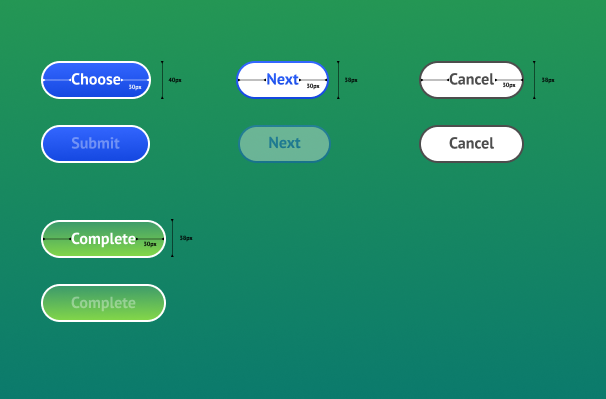
Call To Actions (CTAs): White to black linear gradient for text clarity.
Buttons: Rounded corners with a hover and different states for cancelled, disabled, and in use.
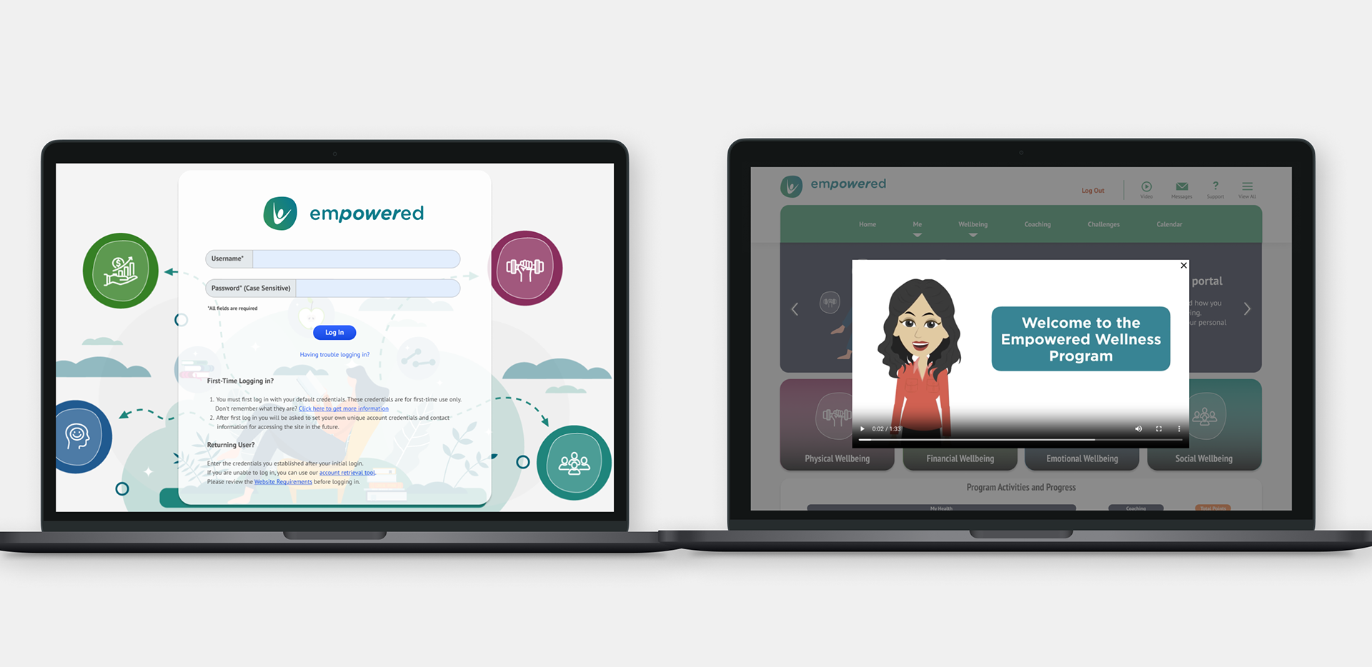
Login: Upon launching the website, users are required to sign in and are welcomed with an overview of the users wellness program.
Homepage & Incentive Tile : Users will complete their incentives and they will earn points or dollars.
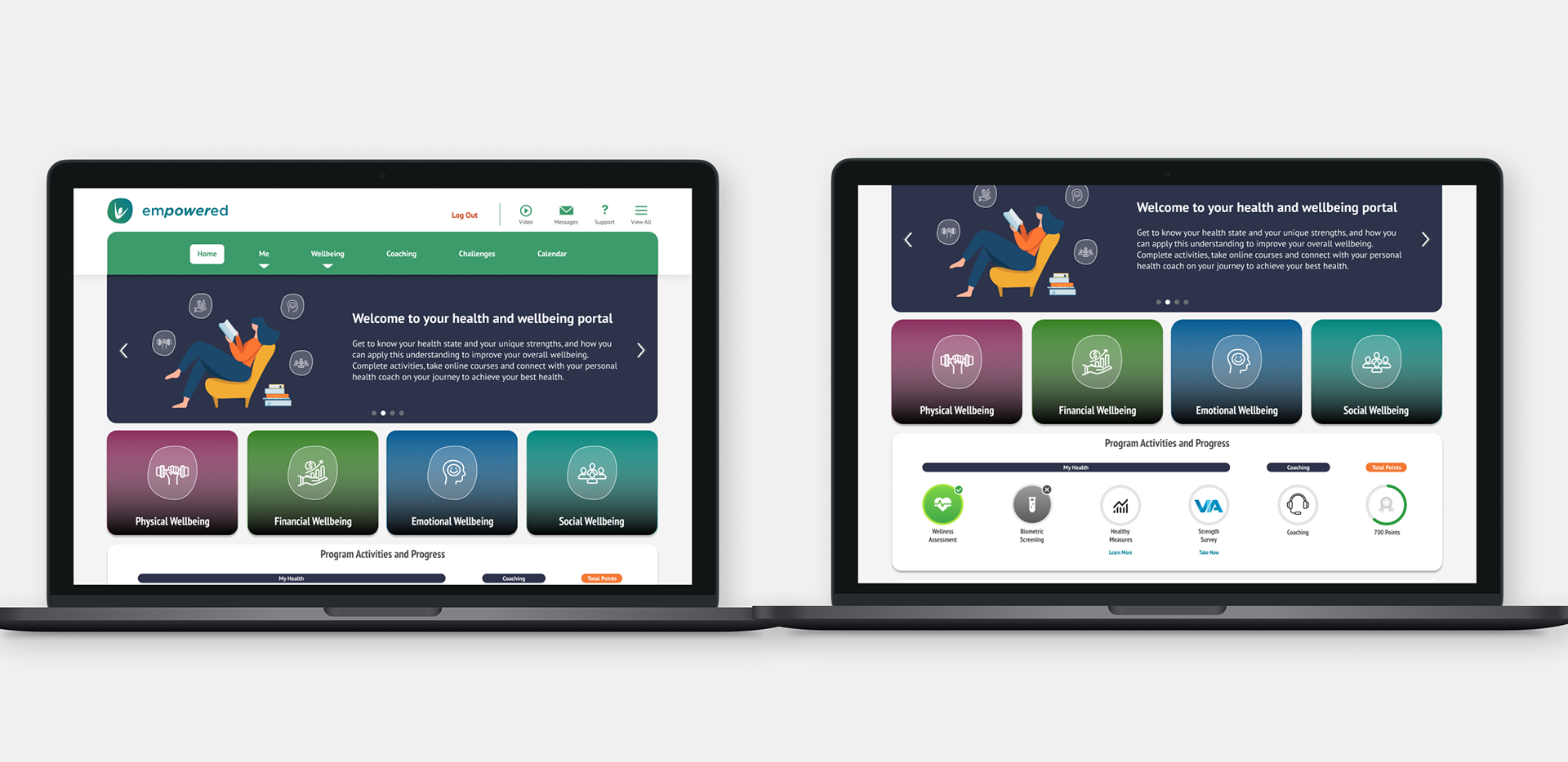
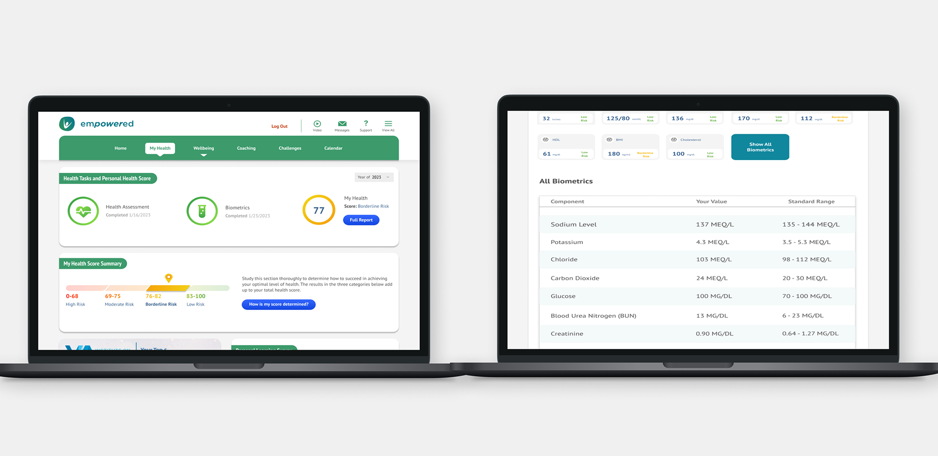
My Health: Users health and other scores as well as biometrics are displayed here.
Four Pillars of Wellbeing: Physical, Financial, Emotional, and Social wellbeing pages dedicated to helping users achieve their goals.

Virtual Garden Course Design
Future Vision: AI-Enhanced Wellness Experience
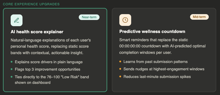
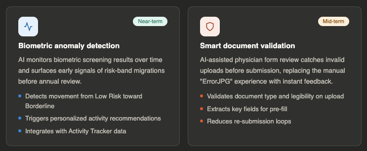
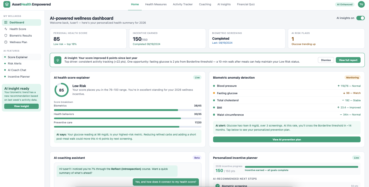
As a self-initiated concept, I explored what the platform could look like with AI layered in, taking the existing health data and making it actually actionable for users.
I designed four near/mid-term features:
AI Health Score Explainer — Plain-language breakdowns of a user's score with specific next steps, tied directly to their data
Biometric Anomaly Detection — Proactive alerts when metrics like glucose trend toward borderline ranges, before they become a problem
AI Coaching Assistant — A contextual chat so users can ask health questions in the moment instead of digging through static content
Smart Incentive Planner — A personalized path to incentive completion instead of a one-size-fits-all checklist
The goal was to shift the platform from showing users their health data to helping them understand and act on it, a meaningful difference for both user engagement and employer ROI.
Outcome & Reflection
Shipped a design system used across web, mobile, and iPad
Launched Asset Health's first native mobile app, expanding the product from web-only to mobile
Improved visual consistency and navigation clarity across the core product used by 50–100 users
Proactively designed an AI enhancement concept that demonstrated a clear product vision for leadership
This project taught me how much a design system pays off downstream. Decisions made early, about typography, component structure, color tokens, saved significant time during both the website redesign and the mobile build. Getting that foundation right made everything that followed faster and more consistent.
If I were starting over, I'd push for usability testing earlier in the mobile app process. We relied heavily on internal feedback during the design phase. Real user sessions would have surfaced navigation assumptions we were making that only became visible after launch.