Overview
Sayin is a healthcare transparency app that helps people navigate behavioral health facilities, reading real patient reviews and finding the right fit for their care. In a space where trust is everything, their website was doing the opposite: it looked outdated, was hard to navigate, and wasn't converting the new users the product deserved.
I was brought in as a Web Designer through Ayuda Software to redesign the site from the ground up.
The Problem
Sayin had a genuine product solving a real problem, but their website wasn't reflecting that. Three issues were compounding each other:
The visual design felt dated and inconsistent, which is especially damaging in healthcare where first impressions directly affect trust. New visitors couldn't quickly understand what Sayin did or why they should use it. And the information architecture made it hard to find what users were actually looking for, increasing bounce and reducing signups.
For a product built around helping vulnerable people make important healthcare decisions, the website needed to feel as credible and clear as the product itself.
My Role
I owned the full redesign independently, from competitive research through to final delivered screens, collaborating directly with the CEO throughout to align on goals, review designs, and iterate based on feedback.
What I Did
1. Competitive Research — I audited the leading behavioral health platforms: BetterHelp, Talkspace, and Larkr, analyzing their information architecture, visual language, and onboarding flows. The goal was to understand the conventions users already trusted in this space, and identify where Sayin could differentiate.
Key insight: the most trusted platforms led with empathy and simplicity, clear value propositions, warm visuals, and frictionless paths to getting started. Sayin needed all three.
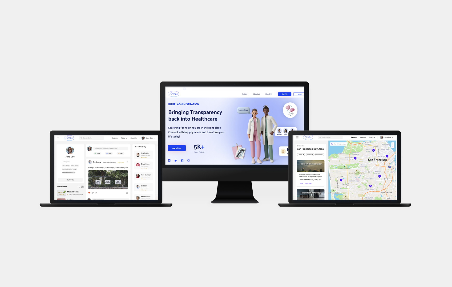
2. Information Architecture — I restructured the site's navigation and content hierarchy to give users a clear, immediate answer to "what is this and why should I use it?" before asking anything of them.
3. Visual Redesign — I developed a new art direction for the site, cleaner layout, better use of whitespace, a more trustworthy and approachable visual tone, while reducing clutter and making better use of screen space across breakpoints.
4. CEO Collaboration and Iteration — I presented designs directly to the CEO at key milestones, incorporating feedback across multiple rounds of iteration. Each review surfaced refinements that meaningfully improved the final product, reinforcing how valuable structured design reviews are, even in small teams.
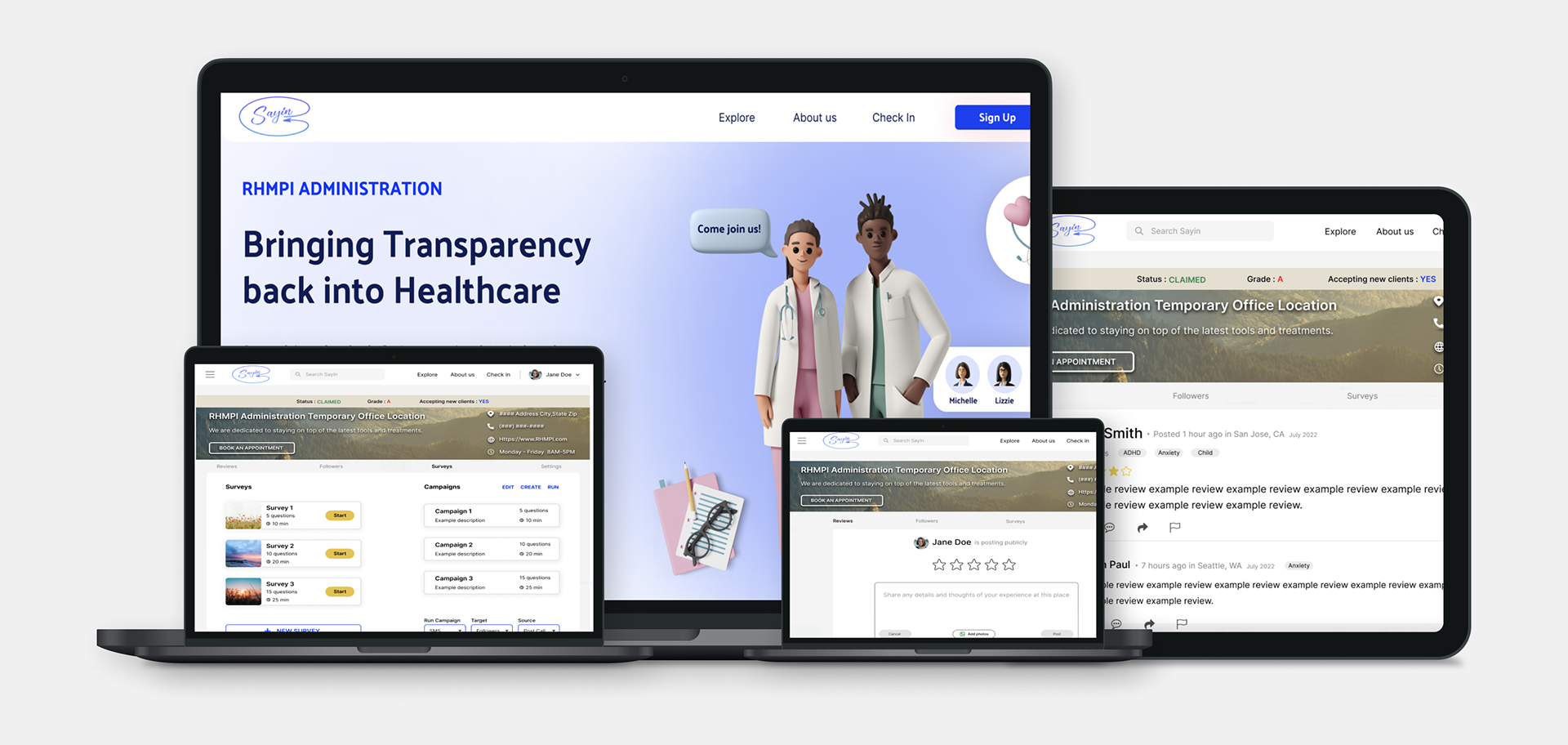
Final Design
Results
Delivered a full website redesign that modernized Sayin's visual identity and improved clarity for new users
Restructured information architecture to reduce confusion and create a clearer path to conversion
Completed end-to-end independently, from research through final screens, on a defined timeline
Reflection
My favorite part of this project was the direct feedback loop with the CEO. Design reviews that used to feel like checkpoints became genuinely generative, each session surfaced things neither of us had caught alone. It made the final product better than either of us could have produced independently.
What I'd do differently: I'd push to recruit 3–5 real users for interviews before touching visuals. The competitive analysis gave me a strong foundation, but hearing directly from people who had struggled to find behavioral health care would have made the problem framing sharper and the design decisions even more grounded.